
Fun, Easy & Hilarious
Debate App
Let's Fight!
Overview
The Mission
To provide a fun way for users to communicate with different perspectives
Time Frame
1.5 weeks app design + 1.5 weeks video making
Team: 2 people
My Job: Design, Organize the project, Lead the progress, Video editing
My partner's job: working with me on most of the steps including ideation, wireframing, and design.
For this project, my partner and I worked closely together. Though I organized the project, we put in almost equal efforts and were involved in all parts of the process together.
BrainStorm& Strategy


Market Research
What we are looking for: Different types of platforms
- Landing Page
- Relationship between posts' presentation style & platform culture
- How does the design inform the type of conversation & interactions on the platform, comment section, and overall culture?
Most platforms are content focused and a few are user reaction focused
Content Focused
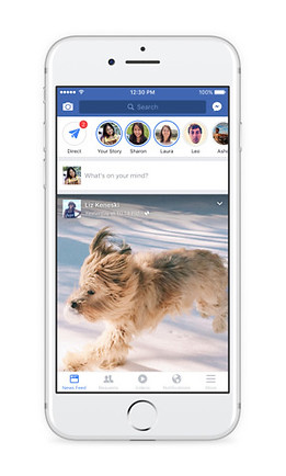

- Users need to perform an additional action to view comments & replies
- Strips/box format used to present content
- Texts & images have a similar hierarchy
- Most have a thumbnail of image, title, and text
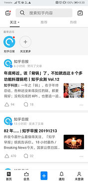
Content + Reaction Focused

- Comments directly underneath the post, no additional action needed to see comments
- Need additional action to see replies to the comments
-> Results in a comment section dominated by individual opinions and likes rather than deeper conversations.
Reaction Focused
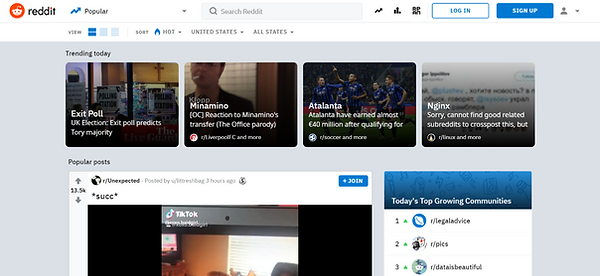

- No action needed to see replies to comments/comment threads.
- The visual hierarchy of comments emphasizes and encourages replies to previous comments (not only are replies to the original comment encouraged, but replies to other replies are also encouraged).
-> Result in conversation threads where each reply builds on the other. Often times one person would start a sentence and others would finish it.
Others

.png)
- Masonry or gallery format creates an Image-focused platform.
- Tinder uses a unique format that focuses the viewers' attention on one piece of content at a time. Its individual swiped cards, which take up the whole screen, emphasize the quality rather than the quantity of the content.
Conclusion
Debate - Reaction & Interaction Focused
Our app is a debate app, therefore:
- It focuses on the quality of the content rather than quantity. The topic & the richness of the comment section are what attract users.
-> Present posts one at a time rather than multiple posts on one screen.
- Encourages interactions (e.g. replies to comments).
-> Show voting on the same page as the content. Users shouldn't require additional actions to view comments and their replies.
- Visually displays distinct standpoints of a topic which is not a feature found on most platforms.
->Easy and clear visualization
Wireframes


We switched from having a scrolling page of debate topics to having a singular swipeable topic card on each page:
- The scrolling action encourages users to quickly look through a large number of topics.
- Where scrolling is an endless action, swiping enables users to focus on one screen at a time. Swiping gives more attention to the information presented, therefore allowing users to focus on quality rather than quantity.
Final Prototype
Choosing a Topic
Content Focused Designs:
- Easy swipe to view topic cards
- Curated topic recommendations
Community & Culture Building:
- Hot topics page
- User-generated debate categories.
Debate
- Choosing an opinion automatically leads users to debate comments which encourage replies
- Open and timed debate option
Debate History
Users Feel Validated
- Shows Users which opinion is more popular and if their comment/debate topic is liked
- Shows who the winner is for timed debates
Profile
- Follow creators to see their new debates appear on your home screen
Create a Debate
- Customize debate cards
- Option to set timed debates
Frame Designs


Conclude & Reflect
What We Achieved
• Comment & interaction focused platform
The swipeable debate card format lets users focus on the content of the topic rather than the number of topics.
By reducing the number of actions needed to go from topics to comments and comments to threads, users are encouraged to engage in conversation
• Encourages comment treads instead of a mass input of opinions
Color-coding the debate teams, showing comment treads and their corresponding team colors, encourage interactions that build on teams' previous comments
• A fun, care-free environment
The customizable, colorful, and simple debate cards set the tone for fun and easy-going debate topics rather than heavy ones.
Improvements & Next Steps
• List from v.s. page form
The daily hot topics page is still in the list form as opposed to the personal recommended debates home page, which is in swipeable cards form. We want to provide users the option to see more topics when they try to see what is popular for other users, but this is not yet validated to support our quality > quantity approach yet. We need to test if users do choose to stay on the swipeable card form more or do they switch to the list form more instead. We need to validate if it is helpful for them to have both formats.
• Relationship with the debate
Do users have a long term relationship with their debates? Right now the design is targeted towards a short term relationship where users stay engaged in a topic for the first them and abandon them. They may go back to it from time to time from their "Past Debates" page. It would be interesting to experiment on what a long term engagement would look like and if it's what the users want. (e.g. Perhaps sending users increased updates on a debate they joined)
• Surface Level Design Iteration
Do we have clear visual definitions?