
Augmented Reality Interface for NASA Lunar Missions
Problem: How can we give astronauts autonomy to complete their tasks in space without the help of Mission Control?
Solution: Provide AR tools to help assist and automate the process of major tasks in Space.
Time Frame: 1.5 years
Team: 16-20 Designers & Engineers
My Role: Project Co-Lead, Design Lead
Client: NASA
AR Interfaces
To assist astronauts during their extravehicular activities
Including navigation on the lunar surface, vitals display, geological sampling tools, search and rescue
Context

Our team's HoloLens Interfaces getting tested by NASA Designer Skye
NASA Spacesuit User Interface Technologies for Students (SUITS) Challenge selected our team to develop Augmented Reality (AR) software on the HoloLens.
With the HoloLens, we can create 3 types of visual elements...

Registered in the environment in a set location
Sticky interface registered in the environment following the user's view
Registered to the hud following the user's view
Team & Milestones
Team: 16-20 members
2 Team Leads: Bowen(Me) & Selena
UI/UX Design Lead: Bowen(Me)
-
4 Design Sub-teams
2 Software Leads

Research
We talked to: 5 AR, voice, navigation designers, 2 NASA Designers, 2 Brown Planetary Geo-science Professors, and 2 Astronauts!

James H. Newman
Former NASA astronaut

Steve Swanson
Retired NASA astronaut

James W Head
Worked on Apollo Programs
What are some Challenges astronauts face on the moon?
1. Difficult to Navigate
-
Dangerous terrain with tripping hazards
-
Environment with no distinctive features for landmark recognition
-
No GPS, relied on route memorization and photos

2. Limited Movements
-
Whole-body movements are required to accomplish simple tasks
-
Small hand gestures require a large amount of effort
-
Both hands are required for most tasks

What are their main objectives on the moon?
1. Navigation
- Long-range point A to point B
- Short-range terrain mapping & obstacle avoidance
3. Staying Alive: Vitals
Vitals and suit status
2. Geological Sampling
- Taking Samples
- Documentations
3. Staying Alive: Rescue
Emergency Navigation & Communication
Ideation
Objective-based User Profiles
I separated our team into design sub-teams based on the main mission objectives and conducted 3 scenario-specific user research.
Navigation
Extravehicular Activities (EVA)
Geological Sampling


Ideation Summery
Based on the challenges & objectives, the teams went through lighting rounds of ideations.
.jpg)
💡 Learning to eliminate
There were a lot of amazing ideas that would improve the AR experience which we had cut out because we couldn't do everything. We have to ask ourselves, is this function/feature necessary to achieve our goals? If not, let's put these aside into our future features bank.
User Flow after simplification
Navigation
.jpg)
Vitals, Geo-sampling, Emergency Communication

Design Iterations
Iteration Learnings


💡1. Lessen & attach elements in the environment
Problem: Users were often confused when there is more than 2 sticky interfaces floating and following them in the environment. It became hard for them to understand where things are especially when they are doing other physical tasks at the same time.
Solution: Minimize the amount of interface registered in the enviorment that follows the user's view to one at all times. Attach elements to each other into a unity to avoid spatial confusion.

_Page_2.jpg)
💡2. Set separate use cases for each plane of interaction
Problem: Users' attention can only focus on 1 plane of interaction at a time. when they are looking at elements registered in the far environment, they miss elements right in front of them, and vice versa.
Solution: We limited all decision-making processes where users have to be focused on the screen to the sticky interfaces floating right in front of them, all guiding tools such as compass and time to the hud, and all elements that are used while users are actively doing something else, to the environment.

Images: Use case for the map and directional guidelines are separated, directional arrows became a pathway to emphasise it's plane as in the enviroment

_Page_3.jpg)
💡3. Automate processes & combine features
Problem: Hand gestures require extra effort. To save astronauts' physical energy and attention, we have to minimize the amount of input needed in a flow.
Solution: On top of designing voice commands, we automated each flow as much as possible. letting one action directly leads to the next. We combined multiple features into one, and ask ourselves what is the least amount of elements needed to achieve a goal?
Automate Processes
Combining Features
Mini-map's function of illustrating direction could be eliminated by adding a direction indicator on the compass. the map's close-range function of showing the route could be performed by having a navigational pathway rather than arrows in the environment.

Mini-map
%20%E2%80%93%201.png)


_Page_3.jpg)
Pathway in environmental showing approximate closeness to destination with color
Red Direction Indicator added
💡4. Clear the field of view,
Test in the HoloLens early!
Problem: Having interfaces opening right in front of astronauts would obscure their field of view. What are some ways where we can leave the space straight ahead clear?
We experimented with different methods of placing interfaces and the menu bar.


When we put these designs into the lens, we realized our favorite solution - the minimized frame (right image) does not work in an AR environment because in real life the edge of the frame doesn't exist.
A simple solution would be to set each interface to open slightly to the left of the lens frame, to the user, they would look complete in the environment but on the left at an arm's length away.

Final Designs
Navigation Selection
Automated simple interactions
-
Switch menu
-
automatically opens navigation tools once the route is selected
Navigation Mode
Show information with less
-
pathway changes color as the astronaut move closer to the destination to indicate distance
-
direction indicator on the compass shows the destination direction
-
arrival time under mission time
_Page_4.jpg)
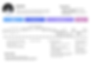
Staying Alive: Vitals & Controls
Organizing information hierarchy
-
Make important information more accessible by highlighting it with color and layout
-
using visual graphs to display numbers
Emergency&
Geological
Sampling
Fast entrance
-
Message inbox automatically opens when an emergency message is sent
-
Geo instructions cheat sheet were added to geo-notes under astronaut's request during testing week.
Finished Products & NASA on-site Testing
Footage from HoloLens during a simulated test at NASA
Recorded from Unity
A week of On-Site development & software iterations at NASA Johnson Space Center!

Core Leadership team at JSC in Huston! My co-lead and I, and our software leads


NASA evaluator Skye tested our software while performing mock astronaut tasks at the simulated lunar environment.


Showcasing our designs to NASA engineers, and working on code well into mid-night at the hotel.


Creating an interface controls panel as a backup after we encountered poor lighting on our first dry run on the test site (The HoloLens doesn't run well in poor lighting environments). Thankfully we didn't have to use this later.


Iterating code until the last minute and testing at the environment.
Feedbacks from NASA

Validations
Very intuitive and clear user interfaces
"The buttons worked well, I can see the tools on top of each other, and the layout was intuitive. The vitals screen looks clear."
Have just the right tools needed
"Having an additional map that opens up is helpful on top of the 3d Line(pathway) "
"The line(3d pathway) was pretty cool, it led me right to the destination."
Moving Forward...
1
Explore AR interactions that we haven't played with! Actions such as pinning an element to a user's body part.
"It would have helped if the map could be pinned to my lap."
2
Design more feedbacks!
"It would help to have distance markers along the path, and more precise distance summaries during navigation".
3
Design for more scenarios
"When key consumables from the vitals screen are in low supply, a way to highlight that to the astronauts through a change in color or an alert would be helpful."
What I learned from the experience!
💡 Project Management: Don't be afraid of structures
Having a structure is scary, it sounds like "hierarchy" - a dirty word in the student world. I worked to find the balance between deciding everything equally as a team and having clear structures and responsibilities set out. I found that for this project of 20 members, narrowing the type of decisions each member has to make creates a more efficient and less confusing experience for everyone.
💡 Distribute responsibilities & provide meaningful feedbacks
I learned the best way to create enthusiasm and momentum is to find opportunities to distribute responsibilities to those who fit, and to seek professional feedback, such as those from astronauts, for the team often.
💡 Implement early, and fast!
Due to COVID, we did most of this project remotely and didn't implement our designs to code until later than we would have liked. We learned quickly that what is in Figma, behaves entirely differently in Unity, and what we have in Unity, is nothing like what it becomes in the HoloLens.
Thank You!
Thank you! I am very excited to show you this work and I would love any criticism and welcome any feedback from you!